
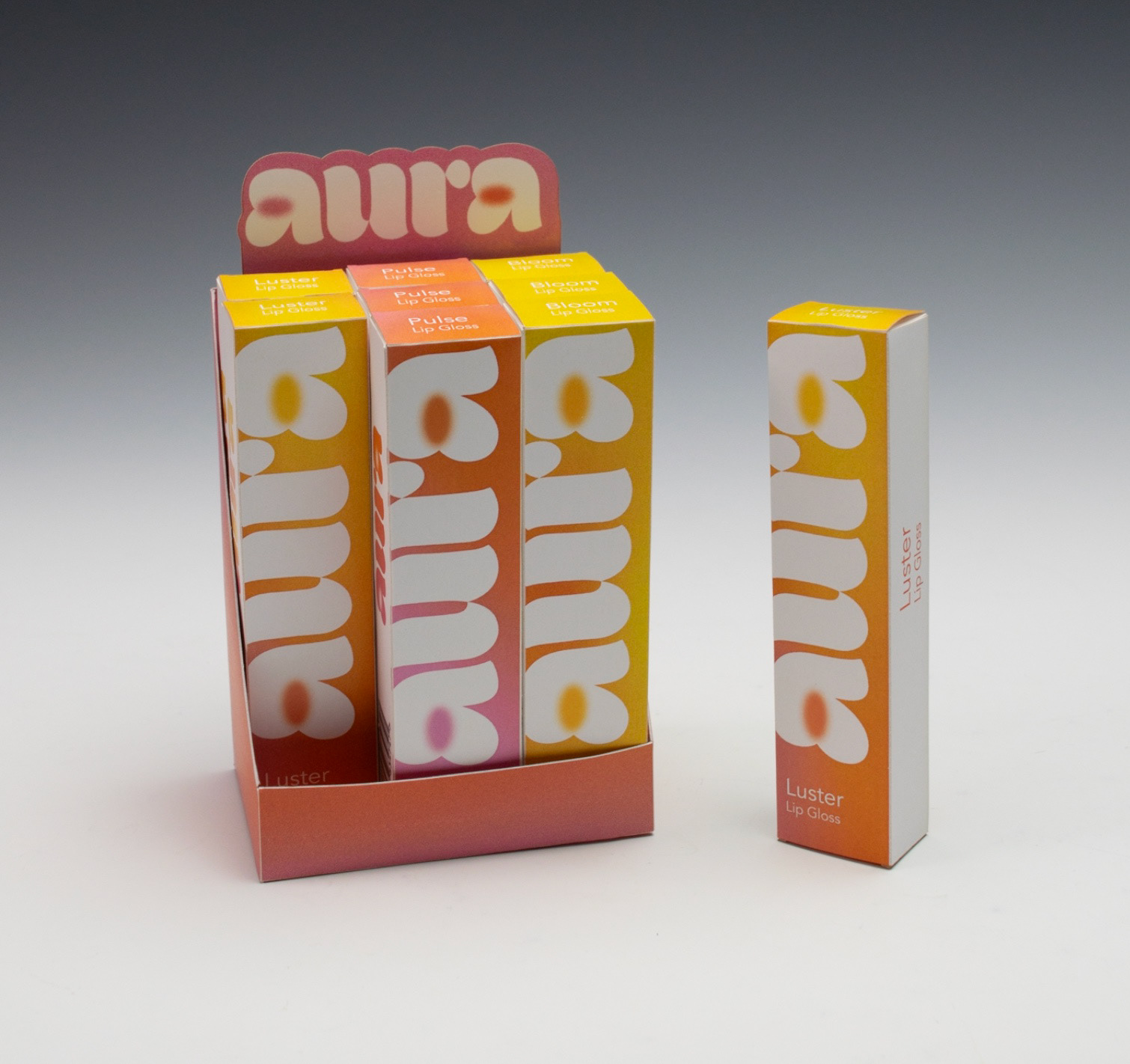
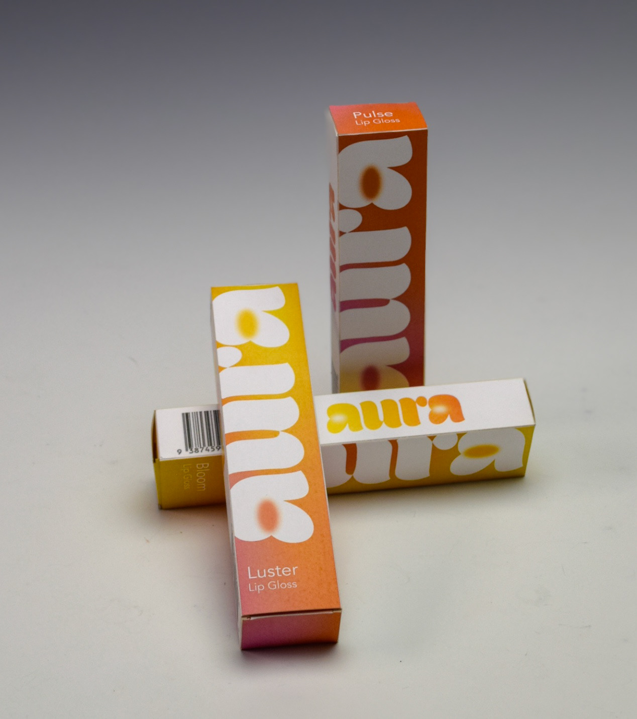
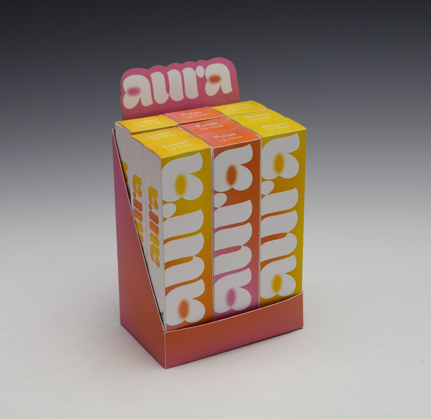
Aura is a hydrating, high-shine lip gloss brand I built from concept to completion, designed for Gen Z consumers who love a subtle but glossy finish. I created the product packaging and pop-up boxes, along with a full brand identity centered around bold minimalism and fun, vibrant color. From the logo and color direction to typography and overall visual tone, Aura reflects my ability to craft trend-forward, cohesive branding systems that feel modern, aesthetic, and intentionally designed.
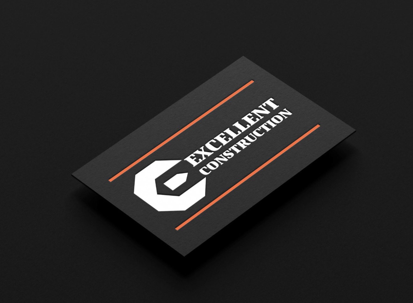
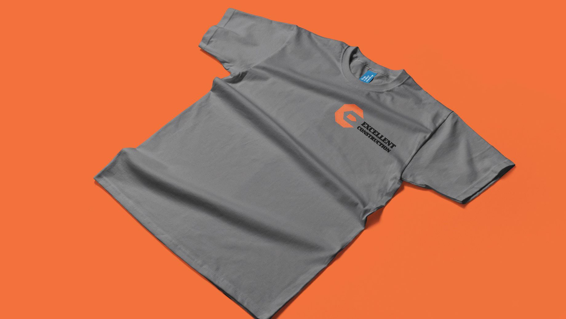
Excellent Construction Brand Identity Design
I designed a custom logomark that merges the letters E and C to represent the client’s brand identity in a clear, memorable way. The mark was crafted to stand confidently on its own or work seamlessly with the word mark, ensuring a strong visual presence across print and digital platforms. To create a cohesive brand system, I also developed the word mark, built a refined color palette, and produced mockups showcasing the new identity in real world applications. Beyond the visual elements, I collaborated with the client to craft a concise slogan that reinforces their message and ties the design together. The overall look draws inspiration from dark, industrial tones, reflecting a modern, clean, and dependable personality. This aesthetic aligns perfectly with the client’s goal of projecting strength and professionalism while keeping the design fresh and contemporary.


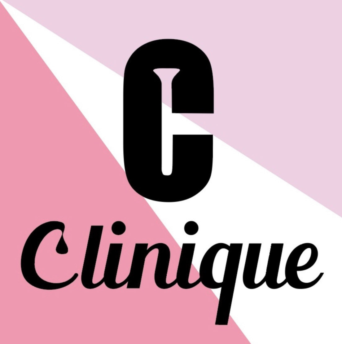
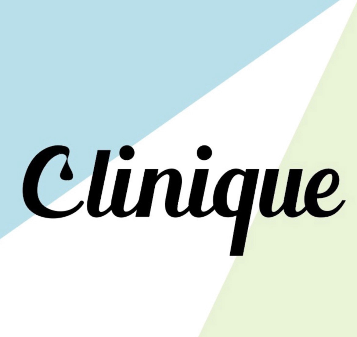
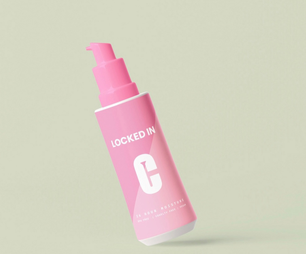
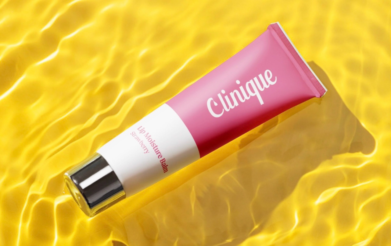
Clinique Rebrand Concept
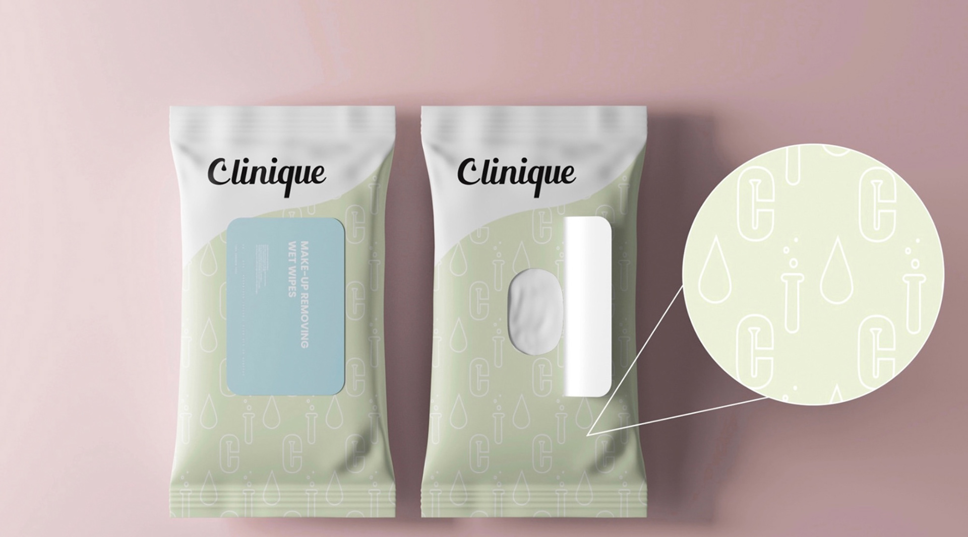
I created a rebranding proposal for Clinique to better connect with Gen Z, the most influential skincare and makeup audience today. The goal was to modernize the visual identity while honoring the brand’s heritage. I refined Clinique’s iconic “C” logo by subtly incorporating a test tube, nodding to its science-backed roots. A brighter, more energizing color palette brings freshness and modern appeal, helping the brand stay current without losing trust. I designed product mockups to show how the updated identity translates across packaging, enhancing shelf presence and appealing to younger consumers. The result is a balance of Clinique’s classic sophistication with a forward-thinking, science-driven edge familiar yet exciting for the next generation.